Starting On Twitter
July 19th, 2017 by Proprietor
Taking a break from the Brady Bunch posting. Will probably post another Brady post on Sunday with a new Kid Spider Comic.
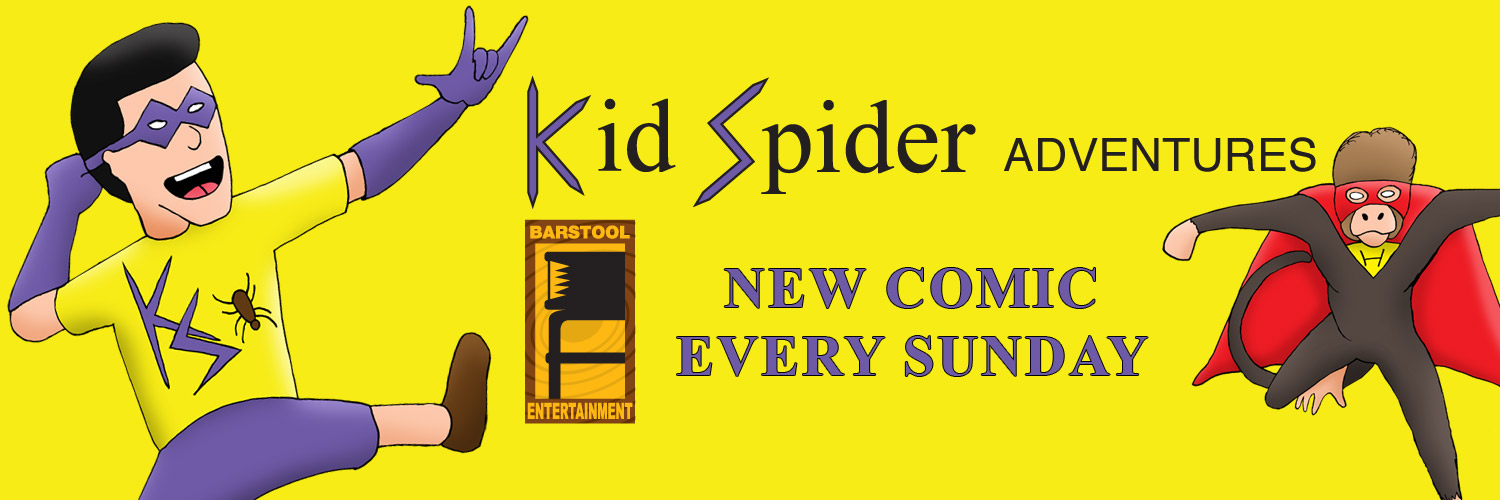
I started a Twitter account to possibly generate some interest in this site, and because Facebook is becoming somewhat disinteresting. Being a graphic designer by trade, I want my designs and work to look good. Social media seems to not allow for that. Facebook and Twitter give artwork size for the background images, but do not give specifics. That is left up to third party sights. There is usually cropping, and scaling happening, along with header or footer areas, with indents that disrupt the art. The artwork for my current header is below.

Twitter gives the size of 1500 pixels wide by 500 pixels high for the background art. The intent is for people in general to put something nice behind and then use the inset art for logos and branding purposes. The inset is 400 pixels by 400 pixels square with a circular overlay that crops out some of the art. In the main background art, there is opportunity to put logos and other information but it is tricky due to various ways the art is handled.
When I placed my first design, based on the simple 1500×500 it looked terrible. There was a scaling effect, and the header and footer, as well as the inset made the artwork look bad. After taking some screen captures and doing some redesign my main background image, looks like the image below on twitter.

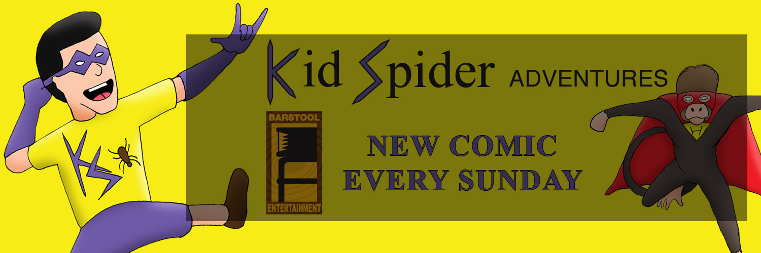
I was not too worried about the Kid Spider or Helper Monkey images, but I did want the Barstool Entertainment logo, Kid Spider Adventures logo, as well as the announcement of when the comic is published regularly to be unobstructed. I found that Twitter not only scales the art somewhat, there is a cropping for the header and footer. Also the inset can obscure any pertinent information. I found the best safe space for the branding information. In the graphic below, I covered over my main Twitter art with a semi opaque box indicating the area.

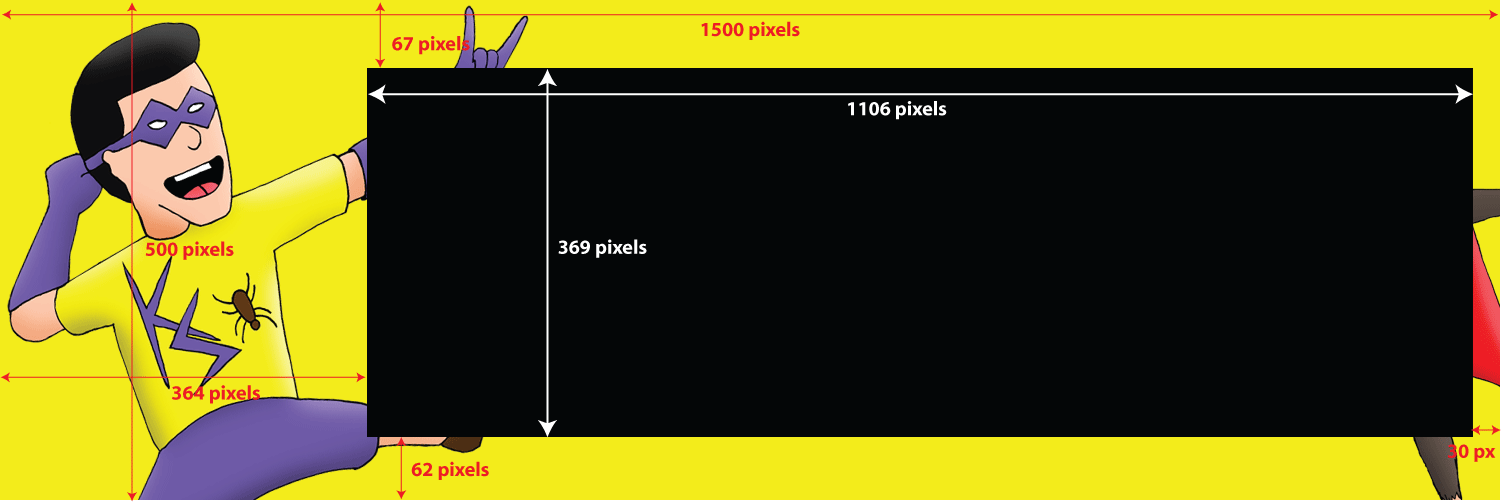
As you see, the logos and announcement fall within the area. I put another image below giving measurements from top and bottom, as well as left and right in which the safe space floats. The measurements are not 100% accurate, but they will help.

As you can see. The safe space starts 364 pixels to the right, this accounts for the circular inset. The safe space also starts at 62 pixels up from the bottom. This accounts for Twitter’s navigation. The maximum height of the safe space is 369 pixels. This accounts for the twitter header area. The width of 1106 pixels is to insure you are not cropped on the far right. I gave the measurement in from the right of 30 pixels, but it is not necessary if you keep your safe space totaling 1106 pixels. To be more safe a 1100 total pixels is better.
Hope this helps. If you are trying to include some branding into your Twitter header.
Thanks for stopping by.


